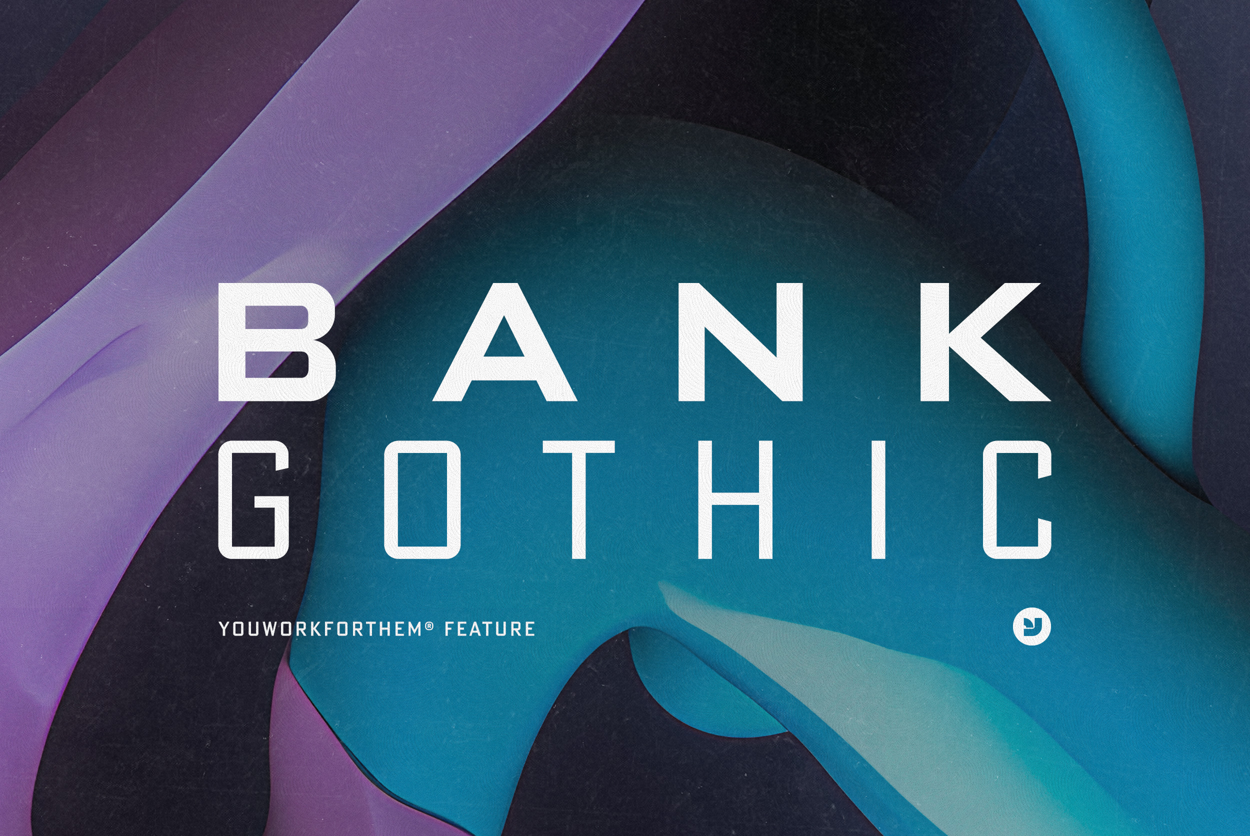
When it comes to the world of typography, there are few names as eminent as Morris Fuller Benton’s. Known for his numerous contributions to typeface design, Benton gifted us with a timeless classic: the Bank Gothic font. Embodying an enduring charm, Bank Gothic (also see our feature collection) has been a beloved part of digital landscapes for decades. Its perfect blend of geometric rigor and subtle roundness has found its way into countless design projects. At YouWorkForThem, we appreciate this iconic font’s legacy and offer not just the original Bank Gothic, but also variations and alternatives that retain its spirit while offering something unique to digital artists.
A Walk Down Memory Lane: The Genesis of Bank Gothic
In the annals of typography, Morris Fuller Benton’s name sparkles with acclaim. Benton, a formidable figure in typeface design, introduced Bank Gothic to the world in 1930. Since then, it has been steadfast in its popularity, serving designers for over nine decades. Its symphony of squared-off letters softened by rounded corners offers a delightful balance that designers have employed in everything from headlines to logos.
Early in my career as an art director at Vir2l (Michael Paul Young, YouWorkForThem Founder), a pioneer in web design, this font was an omnipresent feature in our design repertoire. Although it felt restricting initially, the font’s elegance and precision soon gained my admiration. Seeing it become a part of YouWorkForThem’s collection has felt like a poignant homecoming.
Bank Gothic Variations: Unleashing Creative Potential
Bank Gothic’s flexibility is key to its enduring popularity. At YouWorkForThem, we believe in offering a wealth of choices to digital designers. Here are three unique iterations of the Bank Gothic font, each infusing a distinct character to the original design.


Bank Gothic Pro Distressed
The Bank Gothic Pro Distressed from FontHaus carries a unique appeal, perfect for designs calling for an aged, textured look. Its distressed rendition captures the rustic authenticity of letterpress printing, adding a layer of personality to any design. The font’s attention to detail makes it a stunning choice for large-scale work, and with its set of caps, lower case, and alternate characters, it offers a range of possibilities for the creative mind. The texture of the Pro Distressed variant significantly deviates from the more technical, clean feel of the original typeface, adding a sense of rugged charm. Its worn and weathered appearance suggests a history, lending an added dimension to your design work.


Bank Gothic Pro
Bank Gothic Pro from Fonthaus is for those partial to the classic style while seeking expanded design options. This version includes extended small cap features in each font style, a subtle but meaningful enhancement to the original. Designed by a team of talented type designers who were historically grounded and sensitive to the design project, Bank Gothic Pro stays true to Benton’s aesthetic.
What sets Bank Gothic Pro apart is its ability to remain desirable and versatile even after eight decades since its introduction. Whether it’s science fiction books, posters, countless television and movie titles, computer games, or digital graphics, this font continues to be a favorite. Its regular and condensed style coupled with new small cap and lowercase options in each font makes it fit for the ever-evolving typography needs of the 21st century.


Bank Gothic by ParaType
Broadening the usability horizon of Bank Gothic is the version published by ParaType. It incorporates Cyrillic support, expanding the language support spectrum of the font. This version was created at ParaType (ParaGraph) by Tagir Safayev in 1997 and remains a popular choice for advertising and display typography.
By expanding its reach to support Cyrillic languages, Bank Gothic by ParaType adds a significant amount of versatility. Designers seeking to use the geometrically pleasing aspects of Bank Gothic in diverse international projects will find this version extremely useful.
Our Favorite Bank Gothic Alternatives
While Bank Gothic and its variations offer a wealth of design possibilities, at YouWorkForThem, we understand the importance of diversity and the desire to explore beyond familiar territories. Therefore, in addition to the Bank Gothic family, we present four alternative typefaces that carry the spirit of Bank Gothic while offering a distinct style of their own.


1. Gemsbuck 01
Gemsbuck 01 is a creation of Studio Fat Cat. It’s a super bold and heavy display extended font family. Its assertive and powerful nature effortlessly draws attention. Versatility is one of its strengths, catering to various branding projects. This includes logos, t-shirt printing, and sports designs. The robust design aesthetic of Gemsbuck 01 solidifies your work’s assertive tone. Therefore, it’s an excellent alternative to Bank Gothic.


2. TT Lakes Neue Font by TypeType
TT Lakes Neue is an ode to functionality. Inspired by Finnish signs from the functionalism era, this typeface combines aesthetics and practicality. Despite its semblance to the popular TT Lakes typeface, it introduces a mature approach to design, focusing on details and function. It has a non-contrasting sans-serif design with rounded rectangle ovals and a spectrum of thickness variations across different styles, making it a versatile choice for modern designers. TT Lakes Neue underwent a meticulous design process to ensure the harmony of its character proportions, reshaping and redrawing each character anew. Its wide characters and the uniformity in width contribute to a clean, contemporary feel.


3. Konexy
Mukhlis Muhammad has skillfully designed Konexy. This font pulls from current technology, automotive, and sports trends. It’s a fusion of bold and dynamic elements. Thus, it’s excellent for projects needing a modernity punch. Konexy stands for versatility, supporting multiple languages. It boasts a library of 322 glyphs and numerous stylistic alternates. This flexibility lets designers craft unique branding elements and engaging promotional materials.


4. Vastine
Vastine by Din Studio brings a fresh and dynamic vibe to the table. Designed to breathe life into your branding and add a touch of modernity, fun, and style, Vastine is a font that captures attention. It offers a versatile range of uppercase and lowercase letters, making it a top alternative to Bank Gothic. Whether it’s a bold logo, striking headings, or social media graphics, Vastine can do it all.
YouWorkForThem: Fostering the Bank Gothic Legacy
Bank Gothic has left a mark on design. This early 20th century font was crafted by Morris Fuller Benton. Its strong design is admired even today. The typeface’s bold aesthetic is timeless. It has shaped our approach to design. Classics, like this, never fade.
At YouWorkForThem, we honor such legacies. We offer a variety of fonts and design resources. These include Bank Gothic variations and alternatives. Our platform provides seamless user experience and cash back rewards. We also provide clear licensing options.
Our entity is independently owned. We’ve been in the industry for over two decades. We value the role of classic typefaces like Bank Gothic. They’ve shaped our design landscape. As we reflect on Bank Gothic’s impact, we’re eager to support your creative journey.


