Connary Fagen has a considerable background in art direction, branding and identity, illustration, UI and web design, and motion graphics. As a prolific graphic designer, Connary has an exceptional understanding of the role that typography plays in his field of work, a perspective that aided his incredible success as a typographer. He began designing fonts as means of supplementing his own font library, later offering them to the rest of the graphic design world.
One of his most successful designs on YouWorkForThem is Argent CF, a strong and sophisticated serif letterset released in 2015. Argent CF made it onto YouWorkForThem’s “Top Ten Fonts Of The Year” in 2015, and once again in 2016.
Connary adored Apple’s design work from the 80s and 90s. “I was very young at the time, but we had a Mac in the house since the beginning,” he told us. “I soaked in a lot of Apple’s design, from packaging and manuals to ads.”
During that particular era, the company applied a special cut of Garamond to much of its correspondence and product packaging. Apple’s version was condensed with a tall x-height, lending a playful elegance to their marketing materials. “It was a successful and coherent aesthetic that defined Apple for a generation,” Connary explained. “The typeface was used consistently on nearly everything and it left a deep impression on me.”
2014 marked the 30th anniversary of the Mac, a milestone celebrated by rekindling that classic Apple design. “I also noticed the appreciation for 80s and 90s design that was seeping into the mainstream,” Connary observed. “All of this dovetailed with my desire to capture some of that era into a new, original typeface – something that evoked similar feelings, but wasn’t a corny throwback. Something a designer could use today without baggage. Thus, Argent came to be.”
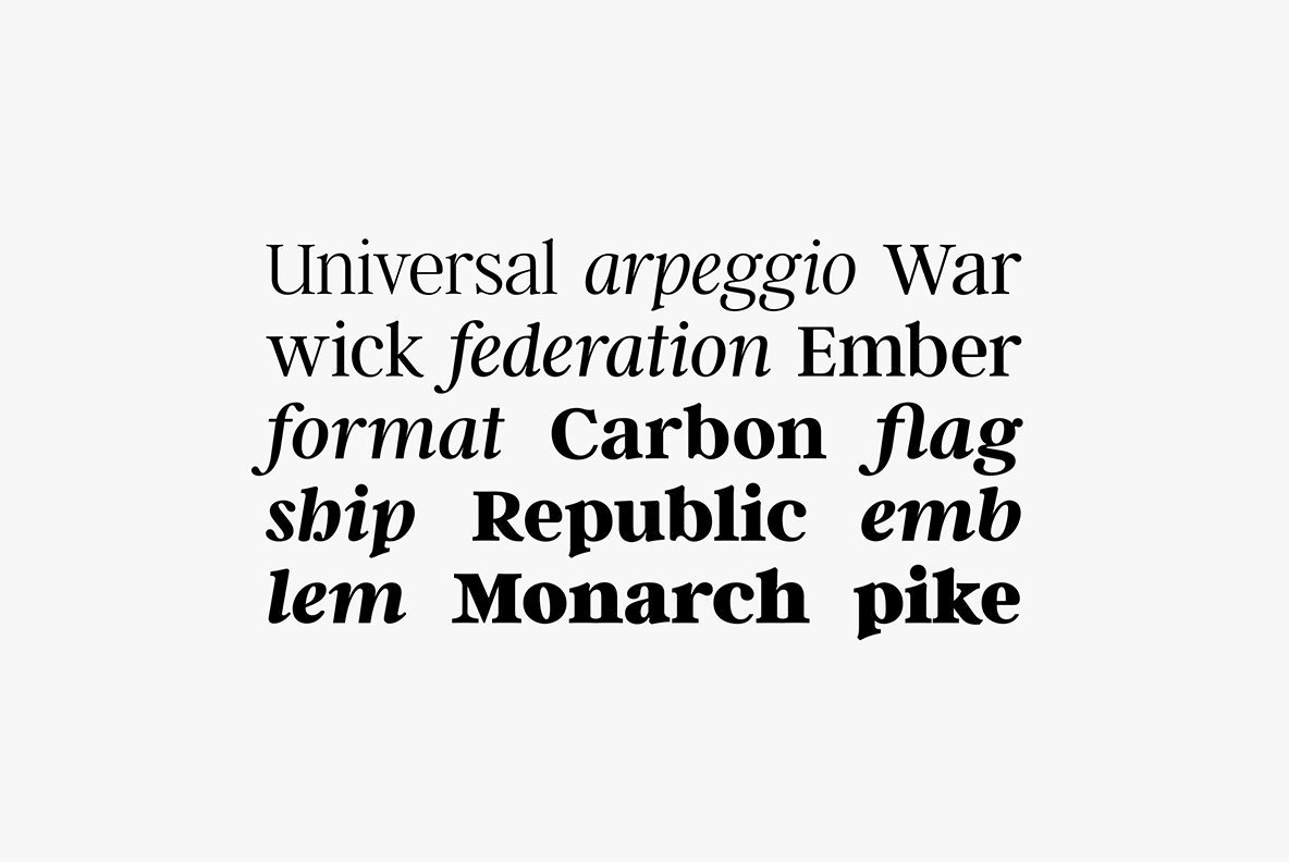
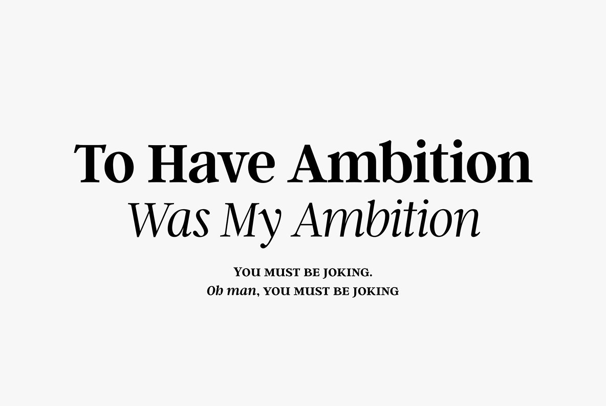
Argent CF is a sleek and charismatic serif that conveys a message with a stylishness that refuses to be ignored. Graceful letterforms and enchanting italics are hallmarks of this type design, available in six weights ranging from Thin to Bold with corresponding italics for each, along with one hefty superweight that’s ideal for the boldest headlines imaginable.
Connary likes the abbreviated descenders of Argent CF, noting that they keep the typeface somewhat compact in spite of its tall x-height. He’s also partial to the capital “U,” which he feels is sort of an overgrown version of its lowercase counterpart. “I saw something similar a while ago and it got stuck in my head,” he mentioned, demonstrating that inspiration may strike from anywhere.
“Before Argent, I had been working on Manifold, which is a very utilitarian design with many straight lines,” Connary shared. “In that regard, it was fun to switch gears and work on a typeface with curves, circles, and contrast. Argent also has a lot of personality, with a little untamed weirdness mixed in with the elegance that people seem to like.”
“In retrospect, I should have planned further ahead with regard to what I was trying to accomplish visually,” he told us. “I wanted to capture an emotion inside a typeface, and I dove in head-first. Since then, I’ve gotten better at drafting up a roadmap before embarking on a new project.”


That’s one bit of advice he would share with new typographers. “Think of one thing that you want the typeface to do well – will it be the best monospaced font ever? Will it build on a previous work of yours? Will it be used for a specific purpose, and if so, what? That line of questioning is a great mental exercise and will result in better, more focused work, and ultimately a well-defined typeface,” he offered.
From our vantage point, Connary absolutely met every goal with Argent CF. Expressive characters deliver their message with passion and intent, greeting the reader with warmth and sincerity. Argent CF is well-suited for a variety of print and digital applications, including headlines, editorials, advertising, elegant corporate communications, branding, identity, and publishing.
Argent CF offers capitals to small caps, discretionary ligatures, standard ligatures, fractions, small caps, oldstyle figures, and tabular figures. Multilingual support covers Basic Latin, Western European, Euro, Catalan, Baltic, Central European, Romanian, Pan African Latin, Dutch, Basic Greek, and Basic Cyrillic for exceptional international accessibility.


You definitely don’t want to miss out on the rest of Connary Fagen’s impressive portfolio through YouWorkForThem. Connary stresses the importance of longterm support for his products and regularly updates his existing work with bug fixes, new features, and product expansions.
“I spend a lot of time going back to my older typefaces and improving them,” he explained. “I feel an obligation toward my customers, and I want them to get a lot of value from their money. I’ve done everything from adding language support to re-drawing entire glyphs. Addington, Argent, and Visby have all received significant improvements in the last few weeks, so be sure to re-download your purchases from YouWorkForThem every once in a while to see what’s new.”


